
Curiosity around my design process has existed as long as I've designed. How I design has evolved over the course of 23 years as I've learned and technology has changed. In fact, you would also find that many legacy charts don't feature the 'new' DMC range of 1-35 because they didn't exist then. Given there is no university course nor Tafe course, designers are generally self taught. Could I teach my husband how to do what I do? Yes. Would it take him years to get to where I am? Yes. To answer a common question of 'why don't you just get another designer' the answer is as simple as.... no two designers are the same, so doing so would mean the designs aren't consistent. Consistency is important and folks knowing it was designed by the one soul matters to me.
Sharing videos of my process isn't something I do, but... What I often share on the Facebook Fan Group is 'where I started' and 'where I ended' which shows where a design began, and where I finished it. Just like 'Spot the Difference', fans get to compare the two to see all the changes made. These can vary from highlighting areas that are too dark, fixing colours that don't belong but the more subtle colour reductions are not really visible to the naked eye. If it were a piece that by some miracle, ONLY needed a reduction, you probably wouldn't be able to tell with the naked eye.
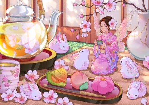
Here is the art. This is from Miss Holly.
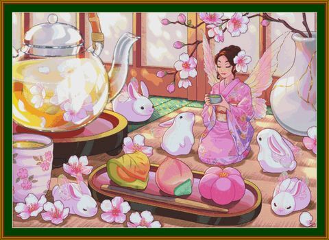
This is my raw design. The first push so I can inspect it and decide what I want to do with it. I then compare it to the original art and decide what I need to change. Even though I know before import which colours will be troublesome, I still do this first push as a visual aid.
It's worth mentioning at this stage, this is what I'd release if I was a patternmill today. Do I get accused of being a patternmill? YES! My crime? Confetti. I'll get to that in more detail further down.
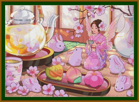
This is what I would call the mid-stage, I'm happy with almost all the colours so it is just a clean left. Now, my legacy patterns do have more confetti in them. My modern have confetti in them. Every design is going to have confetti.

This was extracted from the same work. Look at just how many colours are there to create what you see zoomed out. There are 16,777,216 colours in a 24-bit image. I have to squeeze these down into just 150 maximum number of colours. That's a big ask. And every colour you take away, can make the image look blocky, unnatural, weird. This image is one tiny section of the Spring Tea image. Imagine the rest.
So, confetti is a part of life. It helps build the image, it adds depth and realism and do I miss some confetti I could remove? Yes. I'm human. Do I also have to be realistic with the time I have? Also yes. Do you still get a fantastic design that has been worked on by a human? Yes! Am I a patternmill? No. Was I ever a patternmill? No. Even in my founding days, I would not release a chart if I felt it did not represent the art correctly.
I hope this little window into my process helps fill you all with confidence knowing that I do put a human hand to things.